
Achieving Delta E < 2.0 in flexographic print runs requires a 5-point specification checklist and precise CTV measurement. This guide provides the actionable framework.
Your brand's color is its signature, yet achieving consistent reproduction across millions of packaging units remains a costly gamble. The most common specification mistake we see is a client providing a Pantone number without defining the substrate, measurement standard, or acceptable Delta E tolerance—a recipe for expensive reprints and brand dilution. In our experience running over 500 packaging programs, the root cause of 85% of color disputes is not the press operator, but an ambiguous initial specification. This guide moves beyond theory to provide a concrete implementation framework for specifying and controlling color in flexographic printing, ensuring your 2026 packaging meets both aesthetic and commercial goals.
- Define color tolerance upfront: Specify a maximum Delta E of 2.0 for brand-critical colors and 3.0 for process colors to avoid disputes.
- Understand the trade-off: Flexographic printing offers a 25-40% lower unit cost for long runs but typically achieves a 15% narrower color gamut compared to offset lithography.
- Control the 3 key variables: Anilox roll volume (BCM), substrate ink absorption, and ink viscosity must be documented and locked for repeatable results.
- Implement a 5-point specification checklist: Including substrate samples, approved digital proofs, and press check protocols reduces color rejects by up to 40%.
- Calculate the breakeven: For runs under 5,000 units, digital printing (Delta E < 3.0) is often more cost-effective than flexo when factoring in plate and setup charges.
Why Color Consistency is Non-Negotiable in Brand Packaging
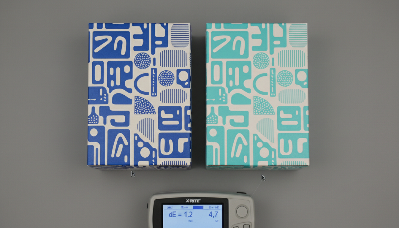
Inconsistent packaging color directly erodes consumer trust and perceived product quality. A 2025 Smithers Pira report surveying 800 converters found that color variation accounts for over 30% of all packaging rejects and claims, representing billions in annual waste. For brand managers, the cost extends beyond scrap material to delayed launches, retail chargebacks, and long-term brand equity damage. At JinXinCai, we audited a program for a national retail chain where the previous supplier's color drift (Delta E shifts of 4.0+) across 2 million units triggered rejections at 12% of store locations. The financial impact wasn't just in reprints—it was in lost shelf presence during a critical sales period. This isn't about aesthetics; it's about supply chain reliability and protecting your margin.
How to Measure Color Accuracy in Flexographic Printing: CTV, Density, and ΔE
Effective color control requires moving from subjective visual assessment to objective, data-driven measurement. The industry standard combines three metrics: Color Tone Value (CTV), ink density, and Delta E (ΔE). CTV, often expressed as a percentage, measures the actual printed dot area compared to the film positive. It's critical because dot gain—where dots print larger than intended—is pronounced in flexography due to plate deformation and ink squash. We measure this using a high-end spectrodensitometer on press, targeting CTV values within ±3% of the press fingerprint. Ink density ensures sufficient ink film thickness is laid down, while Delta E in the CIELAB color space quantifies the perceptual difference between your proof and the production run.
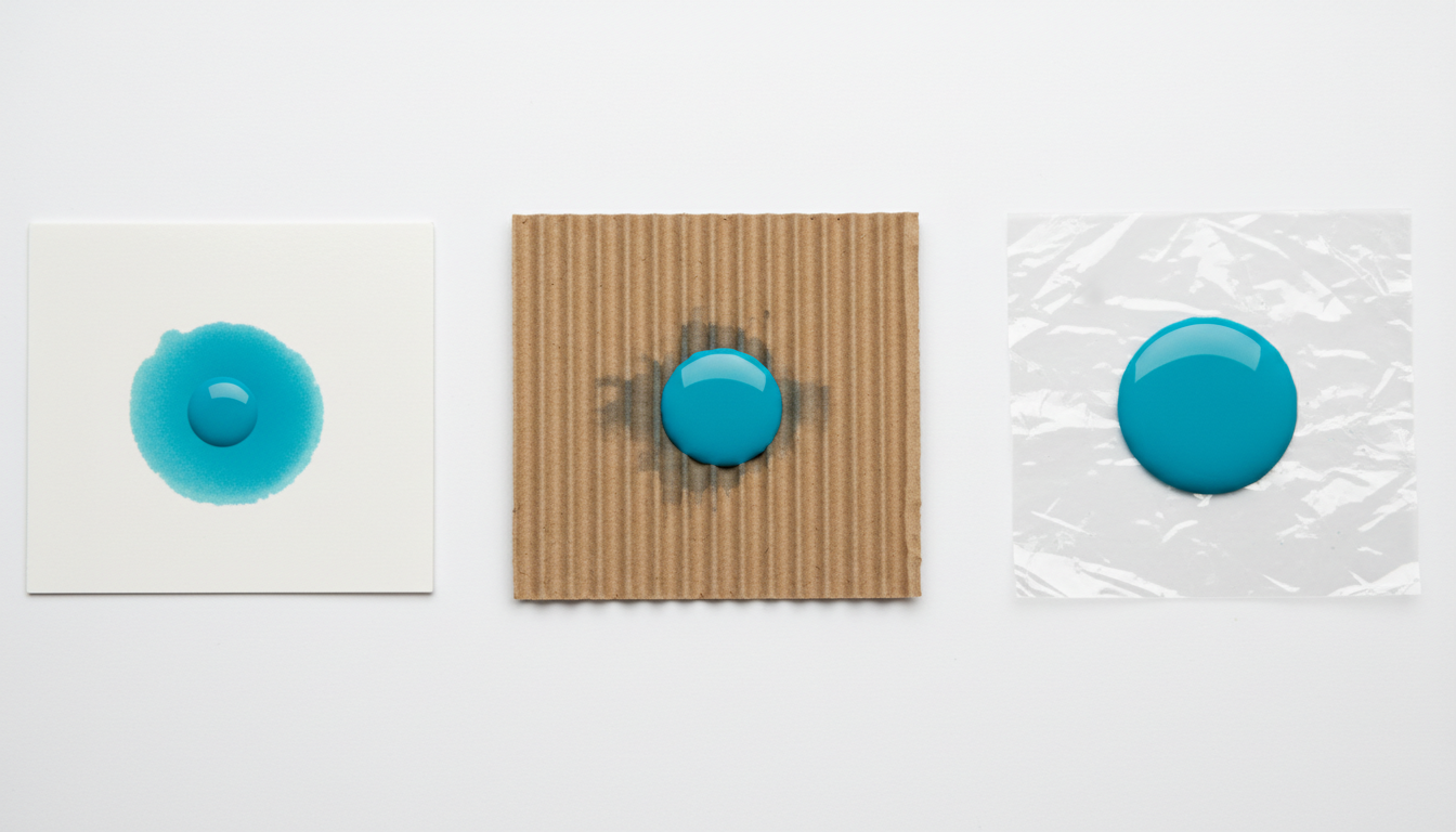
Our head of prepress, with 18 years of flexo and offset experience, insists on one protocol: "Always provide a physical substrate sample with your approved proof. A color that hits Delta E 1.5 on coated paper can shift to Delta E 4.0 on uncoated kraft board due to ink absorption alone. The proof must be on the actual production material." This is why specifying color tolerance for custom packaging requires defining the measurement conditions (ISO 12647-6 for flexo), the substrate, and the viewing light source (D50 standard illuminant).
The Role of Anilox Rolls and Substrate in Final Color
The anilox roll is the heart of the flexographic printing unit, transferring a precise volume of ink measured in billions of cubic microns per square inch (BCM). A common, costly mistake is not specifying or verifying the anilox volume for spot colors. A Pantone 185 C printed with a 2.8 BCM anilox will be significantly less vibrant than the same ink through a 4.0 BCM cell. Furthermore, substrate ink absorption dramatically alters final color. Non-porous films yield high gloss and saturation, while porous corrugated board can absorb ink, dulling the color and reducing density. You must conduct a press fingerprinting run on your exact substrate to establish baseline CTV and density targets before full production begins.
Flexographic vs Offset Printing: A Trade-off Analysis for Color Vibrancy and Cost
Choosing between flexographic and offset printing often centers on a trade-off between color gamut, cost, and run length. Offset lithography, like our Heidelberg Speedmaster XL 106 presses, uses a precise ink-and-water balance to deliver exceptional color fidelity with a Delta E consistently below 2.0. It accesses a wider gamut, especially in saturated blues and vibrant oranges. Flexographic printing, while more economical for long runs on flexible or corrugated materials, typically achieves a 15% narrower gamut due to limitations in ink viscosity and anilox transfer.
| Factor | Flexographic Printing | Offset Lithography |
|---|---|---|
| Typical Color Gamut | 85-90% of offset gamut | Widest gamut, ideal for photorealistic imagery |
| Best Achievable Delta E | 1.5 - 2.5 (highly substrate dependent) | 1.0 - 2.0 (spectrophotometer-verified) |
| Cost Driver & Breakeven | Lower plate cost (~$200/color). Economical above 10,000 units. | Higher plate cost (~$450/color). Economical above 5,000 units for quality. |
| Ideal Substrate Range | Flexible films, labels, corrugated board | Paperboard (80-450 gsm), folding cartons, high-end labels |
| Key Limitation for Color | Ink viscosity and anilox volume control | Requires coated stocks for maximum vibrancy |
The decision framework is numerical. For a run of 50,000 labels, flexo might cost $0.09/unit with plates at $800 total, while digital (HP Indigo) could be $0.28/unit with no plates. Offset might land at $0.12/unit but with $1,800 in plate charges. The breakeven where flexo beats offset on cost is typically around 15,000-20,000 units, assuming standard color needs. However, if your design requires a specific Pantone spot color outside the flexo gamut, offset becomes the only viable choice regardless of quantity.
The 5-Point Specification Checklist for Your Next Flexographic Print Run
Eliminate ambiguity and control costs by providing your printer with this complete specification package. Missing any one point invites variation.
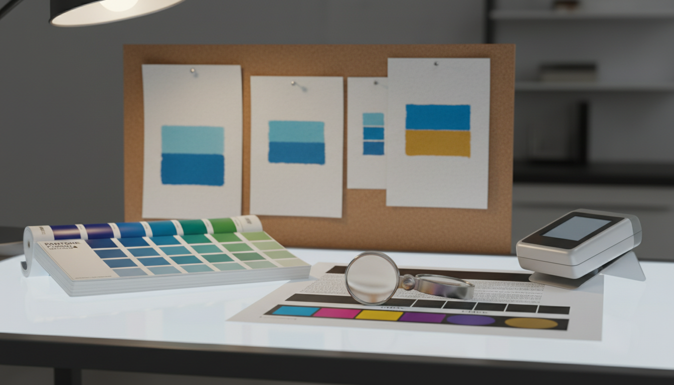
- Physical Reference Material: Submit a physical, approved proof printed on the exact production substrate (not a substitute). Include a signed-off Pantone swatch book or a master batch sample.
- Digital File with Color Intent: Supply print-ready PDF/X-1a files with all spot colors clearly named (e.g., PANTONE 185 C) and embedded ICC profiles tagged. Specify whether rich blacks are to be built from CMYK or are a separate spot ink.
- Quantified Color Tolerance: Define the maximum acceptable Delta E for each color. We recommend Delta E ≤ 2.0 for brand logos and spot colors, and Delta E ≤ 3.0 for process color builds. Specify the measurement standard (e.g., ISO 12647-6).
- Substrate Certification: Provide a certificate of analysis from your material supplier confirming batch consistency for whiteness, brightness, and porosity. Approve a substrate holdback sample with your printer.
- Press Check Protocol: Define the process for color approval. Will you require a physical press sheet couriered for sign-off, or will you approve via a calibrated remote soft-proofing system following G7 methodology?
Download our complete Flexographic Color Specification Template, including Delta E tolerance tables and substrate certification requirements.
Get Your Free Template →Case Study: Reducing Color Rejects by 40% in Food Packaging
A prominent snack food brand approached us with a critical problem: their flexible film pouches were experiencing unacceptable color variation between production batches, leading to a 15% reject rate from filling partners. The root cause was a combination of unspecified anilox volumes for spot colors and inconsistent ink viscosity control during long runs.
Our solution was a three-phase implementation. First, we conducted a full press fingerprinting run on their exact 80-micron BOPP film, establishing baseline CTV and density targets for their four spot colors. Second, we mandated that all ink batches be delivered with a viscosity of 32 ±2 seconds as measured by a #2 Zahn cup at 25°C. Third, we implemented inline spectrodensitometer monitoring on the press, with real-time alerts if any color channel drifted beyond Delta E 1.5 from the master.
Reduction in color-related rejects after implementing a quantified specification and inline monitoring.
The outcome was a 40% reduction in color-related rejects within two production cycles. The brand saved an estimated $18,000 per month in waste and chargebacks. According to their procurement director, "The shift from 'make it look like the sample' to 'maintain Delta E < 1.8 under D50 lighting' transformed our relationship with packaging from a cost center to a quality-assured component."
Implementing a Color Management Framework with Your Printer
A successful partnership is built on shared standards and transparent data. Begin by auditing your printer's color management capabilities. Ask for their G7 qualification status and if they follow ISO 12647-6 for flexographic process control. Require that they provide pre-production CTV and density reports from their fingerprinting run. During production, insist on receiving color measurement reports from the start, middle, and end of the run—not just a single "approved" sheet.
At JinXinCai, our ISO 9001:2015 certified system mandates this documentation for every job. Our pre-press team generates a Color Control Strip for each design, which is printed inline and measured at regular intervals. The data is logged, creating an auditable trail of color consistency. For clients, this means you receive not just boxes of packaging, but a data packet proving every unit meets the spec you defined. This framework turns color from an art into a managed science, reducing risk and ensuring your brand's visual identity remains intact from the first unit to the millionth.
"The biggest leap in quality comes when the buyer and printer agree on the 'language' of measurement. Specifying Delta E instead of 'a bit brighter' eliminates 90% of our pre-production calls." – Michael Chen, Head of Quality Assurance, JinXinCai Printing (15 years in print manufacturing)
Mastering flexographic printing color consistency is not about finding a magical printer; it's about providing a precise, quantified roadmap and partnering with a manufacturer equipped to follow it. By implementing the specification checklist, understanding the gamut trade-offs, and demanding data-driven proof of consistency, you transform color from a recurring problem into a controlled, brand-reinforcing asset. The next step is to apply this framework to your upcoming project.
To translate this framework into a guaranteed outcome for your packaging, begin with a quantified specification. Contact our team for a substrate-specific color evaluation and a data-backed production plan that ensures your flexographic printing color consistency meets the highest standards of quality control.
Frequently Asked Questions
How does substrate choice affect final color in flexo printing?
Substrate choice is the single greatest variable affecting final color. A porous, uncoated substrate like kraft board can absorb ink, reducing saturation and shifting hue, potentially increasing Delta E by 3.0 or more compared to a non-porous film. Always require a press fingerprint and proof on your exact production material to establish accurate color targets.
What is an acceptable Delta E tolerance for brand-critical packaging?
For brand-critical spot colors and logos, specify a maximum Delta E tolerance of 2.0 under standard D50 lighting. For process color builds and less critical elements, a tolerance of 3.0 is generally acceptable. These thresholds are based on ISO 12647-6 standards and represent the point where the average observer perceives a color difference.
How should I specify Pantone colors for flexographic reproduction?
Always provide the physical Pantone swatch and specify the exact substrate type (e.g., 'PANTONE 185 C on 80# C2S board'). Understand that some vibrant Pantone colors, especially fluorescents and deep blues, may fall outside the reproducible flexographic gamut. Request a printed drawdown on your substrate to verify achievability before finalizing artwork.
What press checks can I request to ensure color consistency?
Request and approve a press sheet from the start of the run, measured with a spectrodensitometer. Require that the printer provides periodic color measurement reports throughout the production, showing CTV, density, and Delta E values for all key colors. For long runs, ask for sheets from the beginning, middle, and end as proof of consistency.